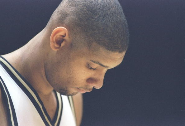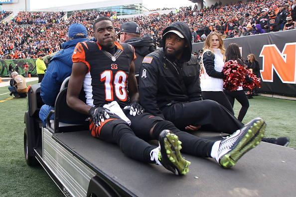
Ever since 2004, the Cincinnati Bengals have sported the same look. Some find it unique and refreshing compared to others. Other fans have considered the kits to be the ugliest in the NFL. As of right now, the Cleveland Browns, Atlanta Falcons, Los Angeles Rams, and Tampa Bay Buccaneers will be sporting new looks. I think it’s time for the Bengals to join this crowd. In 2004, the Bengals were entering their second season under Marvin Lewis and number-one overall, Heisman-winning quarterback, Carson Palmer. The parallels are too good to not notice.
Cincinnati Bengals Uniforms: Is It Time For A New Look?
Thanks to the off-season, fans are often left not knowing what to do. Each year, fans love to mock up some concepts for new uniforms or logos that teams should move to. Here, we will look at a few different concepts. There are some ugly ones here, so be warned. But if you stick with me until the very end, I can promise that the final concepts are very, very nice.
Let’s Start At The Bottom
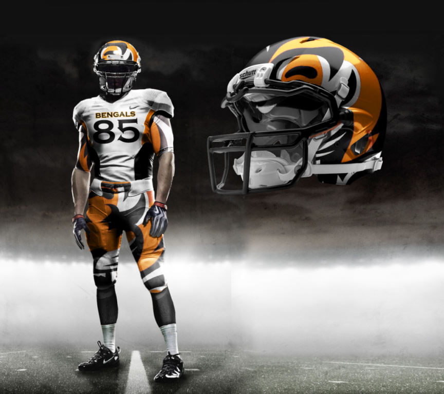
Every year, someone decides to make up a concept that leaves fans scratching their heads. Well, here is that concept. In 2012 when Nike took over uniform design from Reebok, an individual “leaked” designs that were believed to be real and taking over the league. They were false, obviously. Fans and the league alike would not allow Nike to just overhaul the entire league’s uniforms.
If Mike Brown‘s ownership abilities were translated into a uniform concept, it would be this. The helmet sort of keeps strips and a tiger-like feel, but it misses the mark. The jersey itself incorporates “Cincinnati” into the chest, which I support. However, it looks like a low-end Canadian Football League team. Let’s move on.
We Love The Stripes!
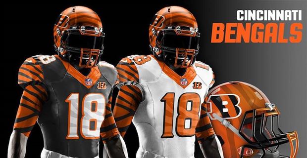
One thing that Bengals fans agree with when it comes to their beloved Cincinnati Bengals uniforms is the stripes. Initially incorporated in 1981, though only made official in 1996, the stripes on the helmet have been a staple in Cincinnati. It would only be natural for an artist to run with this idea. On the left, the website 24/7 Sports debuted a mock-up that showed the stripes within the numbers. Very, very unique! In addition, the “B” logo gets tacked onto the helmet with a more blended, more natural-looking tiger stripe design. I do like changing the font of the numbers on the jersey as well. This one does look a bit more unrealistic and from a video game.
Next is actually from Cincinnati’s own Local 12 television station. While the helmet remains unchanged (because why mess with a good thing?), stripes are added to the shoulders and extend down the sleeve. The numbers do change, but with the added stripes on the shoulders, they prove to be a bid harder to read from above.
Welcome To The Jungle
Next up come from the results of a Sports Illustrated contest to design new Bengals uniforms. The difference between this example and the others is the new logo concept. Since 2004, the Bengals have used their striped “B” logo. Most fans feel like this logo is a bit stale. While many wouldn’t mind resorting back to the tiger head from 1996, or even re-vamping the original tiger from 1968, designing a new logo could be fun! In addition to this redesign, the proposed Cincinnati Bengals uniforms include a dash of green.
Why green when the colors are black and orange? The jungle! Outside of an all-green look (which would make any fan double-take), the only use of this new color is for outlining the numbers. On top of this, the helmet would keep the striping, but the colors would be inversed. I may not find this design to be the best, but it certainly is the most unique and plausible.
We challenged you to redesign the Cincinnati Bengals uniforms.
Here are those results, courtesy of @UniWatch https://t.co/znt0Cgi9OY pic.twitter.com/Pj74PpZpZa
— Sports Illustrated (@SInow) July 19, 2019
New Look With An Old Feel
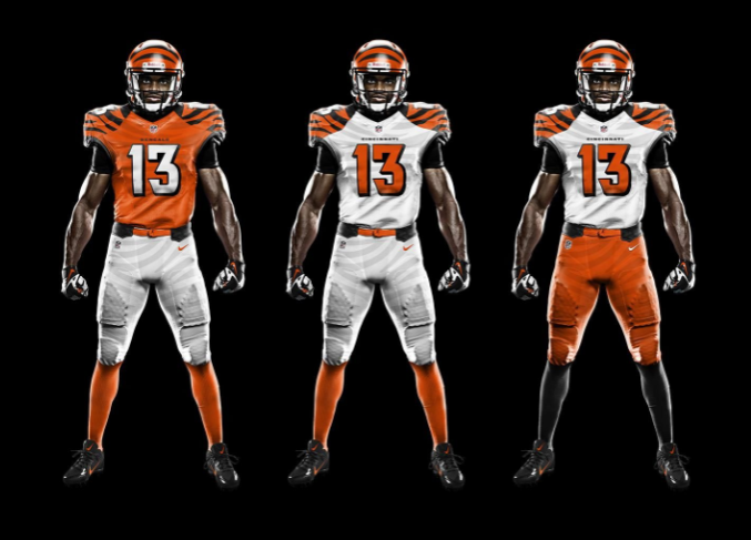
Finally, the new Cincinnati Bengals uniforms that I find to be the best. Thank you to Twitter user Seth Reese (@offseth_) for these because I find them to be phenomenal. Have you ever found yourself wanting to re-vamp the Bengals uniforms but you want to bring back some older ideas? Here you go! The artist proposes multiple combinations of black, orange, and white jerseys, but what strikes me is the changed numbers, sleeves, and the Cincinnati/Bengals on the chest.
The current 3-D numbers do their job. We don’t want to look like the most recent Browns’ changes, so these go to a solid, 2-D design. They are easy to see and contrast well to whichever color is the primary. The sleeves keep the stripes, update them, and avoid becoming overbearing. Finally, by replacing the “B” on the chest with Cincinnati or Bengals, it gives the uniform a more formal look. Even though the artist admitted that the orange is a bit too saturated, I love them. They remind me of the Seattle Seahawks‘ crazy-bright green uniforms.
If you like these, check out his profile. He has numerous phenomenal new uniform concepts!
. @Joe_Burrow10 // @Bengals
new era -> new unis. pic.twitter.com/6BnDf1xF5V— Seth Reese ن (@offseth_) March 4, 2020
A September Update! A New Contender for Best Mocks Enters!
The previous mock-ups were the inspiration for this whole article. Seth did a fantastic job and deserves your support, but check out the newest iteration. These come from Twitter user Dan Royer (@DanRoyerDesign). Just like with Seth’s, these are a modernized kind of throwback. Royer proposes four jerseys: home black, away white, alternate all orange, and color rush black. Considering this is the formula that the team currently uses, a move to this would make sense.
So what makes these so special? They don’t try too hard to be unique. The Bengals uniforms are inherently unique, considering the stripes. The number font is a nice throwback to the previous jersey set (which is a massive win). Considering the mascot is a Bengal tiger, the stripes must stay. On the sleeves will be where the sleeves live in these mock-ups and it’s just right. Not too much; not too little. The current color rush for Cincinnati is nice (considering many want it to be the permanent away jerseys), but black and white with the normal orange and black helmet seems a bit off. Dan proposes an all-black jersey with orange numbers. In all reality, these could be the most complete mocks I’ve seen and I would immediately purchase a Burrow jersey if Cincinnati announced a move to these.
Just like with Seth, check out Dan’s Twitter. He has plenty of awesome designs and is actually available for commissions!
Hey @7BOOMERESIASON !
Simplified bolder stripes (better for TV). Ditched the white down the sides. New color rush which actual color. Let’s do this!!! #whodey Go @Bengals pic.twitter.com/ruiE2sHrlp
— Dan Royer (@DanRoyerDesign) September 8, 2020
Could This Be The Beginning Of A True New Dey?
Which of these designs are the best? Which are most likely to happen? For me, Reese’s designs are the best and most likely to be implemented. They provide well-executed simplicity while retaining the feeling of newness. When the Bengals introduced their new color rush jerseys, the fans absolutely ate it up. Cincinnati loves well-executed change. I am more than willing to bet that if they want to fully utilize the hype surrounding a new age with Zac Taylor and Joe Burrow (presumably), a new uniform combination and re-banding would do wonders. It worked in 2004 for a team that was 2-14 two years prior, it will work in 2020.
Main Photo:
Embed from Getty Images