Over the years, professional sports team logos have evolved to become more modern. Some teams have gone back to the retro sports logos of the past. Either way, many have become part of pop culture, as a result of different values they depict. Many of these logos can be inspirational, memorable and nostalgic. Let’s take a look at my top ten favourite sports logos of all time, both retro and vintage. Some of you will agree to disagree.
The Top 10 Sports Logos of All Time
10. Hartford Whalers
Introduced in 1979, this might be hockey’s finest logo ever. The negative space forms an “H” within the whale-shaped “W”, making this one of the iconic NHL logos and jerseys.
9. Seattle SuperSonics
This logo was introduced in 1975. It is still a very cool retro logo that contained yellow and green colours. It included Seattle’s skyline including the Space Needle.
8. San Diego Padres
Introduced in 1969 and lasted until 1984. It included a swinging friar and was a tribute to the Spanish missionaries settled by Franciscan Friars prominent when San Diego was founded. I still love the brown and gold colour combination to this day.
7. Milwaukee Brewers
From 1978 to 1993, this was the Brewers’ primary logo. The “M” and “B” form a yellow and blue baseball glove. This logo is still iconic and recognizable to this day.
6. Denver Nuggets
This retro logo was introduced in 1982 and lasted until 1993. The city landscape with buildings against mountains gives it a very cool twist. The rainbow colours remind me of the game Tetris.
5. Baltimore Orioles
This friendly, smiling cartoon bird was created in 1966 and lasted until 1988. The team had 19 of 23 winning seasons that this bird represented the team. It’s no surprise they went back to wearing this cap full time.
4. Tampa Bay Buccaneers
Bucco Bruce was born in 1975. Many people will disagree, but this is one of my all-time favourite football logos. Florida orange was used as the primary colour. The creamsicle uniforms lasted until 1997. Retro is back in style. Bring back Bucco Bruce!
3. Milwaukee Bucks
This cartoon deer logo was born in 1968 and lasted until 1993. The original logo featured a caricature of a buck wearing a sweater emblazoned with the letter ‘B’ and spinning a basketball on one hoof while sitting atop the team name. Another one of my all-time favourites!
2. Houston Oilers
The oil rig logo was simple and crisp. It matched the powder blue uniforms perfectly and represented the city well.
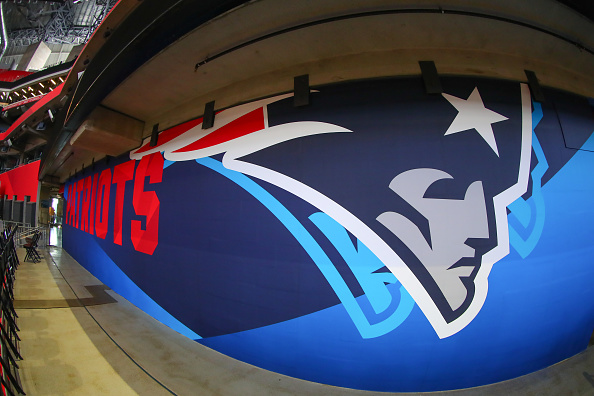
1. New England Patriots
Patriot Pat was born in 1960 and lasted until 1993. It was creative, intimidating and revolutionary. To this day, this logo is still iconic.
Bring Back the Retro Look
There is a sense of belonging we associate with the logo of a team that we have been following for many years as sports fans. Too many modern-day sports teams logos are just that – modern, sleek and complicated. Many retro and vintage logos are simple and cartoonish. This is a representation of the good old days when sports was simple and innocent, especially team uniforms and logos. We live in a different era. Sadly, most of these logos and other retro logos have been retired for good!
Main Photo:
Embed from Getty Images