Jerseys. There are few things in sports more important from a marketing standpoint than the team’s jersey. How much merchandise does your average sports team sell that doesn’t in some way shape or form feature their jersey? It does so much for a team to have an aesthetically pleasing jersey. In hockey this is no different, many a team have had their share of both the great, nay iconic look. And there have been plenty of awful looks over the years. From doing too much (Tampa Bay Lightning jersey with that storm pattern I’m looking at you) to doing way too little (current Flyers alternate jersey)
Today I’m going to rank the top five best, worst, and underrated NHL jerseys. Before we get this started, I would like to point out that none of the original six sweaters will be here, although the Boston Bruins made a questionable design choice with the rightly reviled Winnie The Pooh sweater, their looks are so iconic it’s hard to criticize them. At least outside of petty whining nitpicks. Anyway, shall we get this list started?
Best, Worst, and Underrated NHL Jerseys
Top Five Best
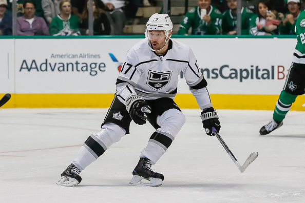
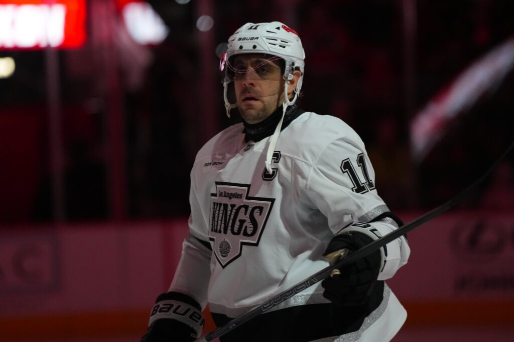
5. Los Angeles Kings (current)
The Los Angeles Kings have had their share of fashion faux pas over the years but these jerseys are great. Sleek, Intimidating, not too busy but not too plain. I’m not even a resident of California but if I was I would wear their jersey… Just not into the United Center.
4. Tampa Bay Lightning (current)
The Tampa Bay Lightning may have been a questionable choice for expansion of the NHL in the mid-1990s, but their current jersey design, which was adopted by the team in 2007, the team adopted a sleek understated look and logo, perfect for a storm that you don’t expect to happen.
3. Minnesota North Stars (1967-1991)
Talk about an often forgotten classic, The North Stars had a great look in Minnesota! I know the logo is cheesy but it’s part of the appeal I guess. I’m glad the North Stars legacy is far from dead, and these jerseys are a great reminder of their heritage.
2. Phoenix/Arizona Coyotes (1996-2003 as well as 2018 alternate jersey)
The Winnipeg Jets move to Phoenix may have been one of the most questionable relocations in sports, but you can’t deny this sweater was a great introduction of hockey into the area. The Coyote is stylized based off of the Kachina native American people, who lived in the American Southwest for ages. It may have been hated then, but the jerseys of Jeremy Roenick and Nikolai Khabibulin have quite the nostalgic following. Myself included.
1. Vancouver Canucks (1989-1997)
In my honest and humble opinion, the Vancouver Canucks should never have stopped wearing this. The jersey of Trevor Linden, Pavel Bure, and Kirk McClelland. The Flying V Canucks jersey was hideous, but perhaps we should thank the hockey gods that it eventually evolved into this beauty of a jersey
Top Five Worst
5. Vancouver Canucks (1979-1989; The Flying V Jersey)
I’ve seen more tastefully designed shag carpeted rooms from the 70s. These were hideous, their original jerseys were great, the uniforms the Canucks wore in their inaugural years were fine, but these… Abominations were worn for 10 years. A decade’s worth of Vancouver hockey fans had to endure these before the awesome flying skate came into the picture for all too brief of a time.
4. Los Angeles Kings (1967-1988, 1995-1996)
The Kings may have some royally cool uniforms now, but boy did we have to endure some awful designs to get there. I’m using two different looks for this entry, because they‘re both an aesthetic crime against hockey fans.
Their original sweaters were louder than a bad rock concert and made the players look like phone books on the ice. I understand they wanted to be symbolically linked with the other residents of the L.A. Forum, the Los Angeles Lakers. But these were just atrocious looking.
And then, of course, there’s the infamous “Burger King” L.A. Kings jersey, the fact that Wayne Gretzky wore this fashion crime is enough. Thankfully they dropped these after only one year.
3. Dallas Stars (2003-2006)
I know, I know, these were the Dallas Stars alternate Jerseys, but these were hideous. I feel like someone threw up hot Cheetos in the shape of the constellation of Taurus (the bull) and the design team went with it. When a franchise Legend in Mike Modano calls them the “Moo-tereus” then you have royally screwed up.
2. California Golden Seals (1974-1976)
The Bay Area’s original team, the Golden Seals look initially was… passable. They could’ve been a lot worse but could’ve done better. But it was after they were purchased by Charles Finley and their colors changed to match the Oakland Athletics that we went from passable to an absolute tragedy. Maybe this is why the team ended up moving to Cleveland and then contracting.
1. Tampa Bay Lighting (1996-1999)
I know, I know, it’s another alternate look but it’s absolutely way too busy. The Lightning had a great regular look, understated but still bold and intimidating, and then there was the thunderstorm sweater. Ouch. my brain hurts just trying to process everything that’s going on with this look.
Top Five Underrated
5. Quebec Nordiques (1979-1995)
You may notice that a majority of the sweaters on this list are of teams that are relocated or are otherwise extinct, and you would be correct. Believe it or not, the Logo is meant to be an Igloo, not an elephant which is commonly believed. Anyway, the nordiques had a simple and supple look that I’d love to see return one day, or the Avalanche bust this out on a throwback jersey night
4. Kansas City Scouts (1974-1976)
Now known as the New Jersey Devils, the scouts had a look that is shockingly well aged considering it originated in the 1970s. The team may have only been there a short time, but the scouts had a jersey that brought the city a lot of honor.
3. New Jersey Devils (1982-1992)
Speaking of the Devils, the Christmas tree devils jersey was so cool (if a bit.. loud.) they brought it back as an alternate Jersey. These beauties are always welcome in my house.
2. Atlanta Thrashers (2003-2006)
The Thrashers look was very… Divisive. You either loved their sweaters or hated them. They just screamed the late 1990s refusing to die. But in the early years of the new millennium, they seemed to hit their stride with their sweaters. Though the Nasty Nest is gone, their memory lives on in these sweaters.
1. Washington Capitals (1995-2007)
Ahh… the screaming eagle Washington Capitals sweater. These were great! The jersey of Olaf Kolzig, Peter Bondra, and Sergei Gonchar. As well as a young Alex Ovechkin. These were some sweet threads that I’d love to see make a comeback.
Main Photo:
Embed from Getty Images


