One of the most exciting things about the MLB season in 2024 was seeing all of the new City Connect jerseys. It was awesome to see all the ugly, cool, and average jerseys that were designed as teams attempted to make good jerseys. Here are all the City Connect jerseys so far in 2025:
*as of May 7th
2025 City Connect Jersey Grades
Houston Astros, Grade: D
The Houston Astros were one of the first teams to unveil their second city connect jerseys. The overall look isn’t very exciting, as the Astros kind of focused on the color white too much. The logo on the hat also looks an Arizona Diamondback logo, and the jersey is a bit lacking. Overall, though, it’s still cool to see a new jersey.
Washington Nationals, Grade: D
The second team to unveil their new city connects was the Washington Nationals. However, this jersey seemed like a swing and a miss. Firstly, it looks too much like their last one, which was better, and lastly, the Nats could do more with their colors instead of a boring blue. With the color red, a team can do a lot with a jersey, which makes it seem strange that the Nats keep going with blue.
San Francisco Giants, Grade: F
The San Francisco Giants’ city connect was worse than ever. Why? It looks like it was made on Canva, and I myself could come up with something better. This jersey was a bland pick and was again something that anyone could doodle on Canva. This just looks too cheap. Overall, the Giants needed more creativity and probably should fire whoever is creating these jerseys.
Colorado Rockies, Grade: B
The Colorado Rockies’ new city connect jerseys are pretty good compared to the others. The Rockies continued to use their mountains in the background nicely. The new jerseys match better with their colors, and it is pretty cool looking. The previous jerseys were better, as the Rockies were very creative with their colors. However, still, these jerseys were a success.
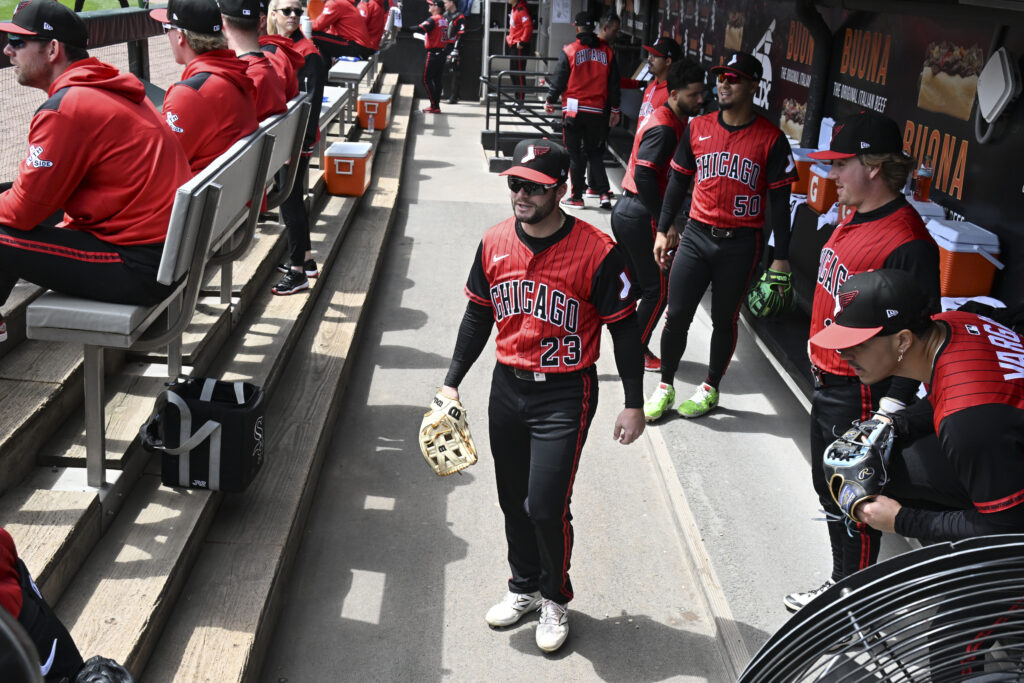
Chicago White Sox, Grade: A
Honestly, the Chicago Bulls look is awesome, especially when mixed with the black and pinstripes for the Chicago White Sox. The color just seems dynamic, and it seems that the White succeeded in being creative. Perhaps using the Bulls is a good way to have fans look away from their current state. Overall, it is one of the best-looking jerseys so far.
Miami Marlins, Grade: C
The Miami Marlins’ new look seems average. Especially since their last city connects were awesome looking, combining some modern looks with some old looks, and just making the jersey look awesome. The new look isn’t horrible, but it doesn’t feel as good as the last one. An area code on the cap also feels like too much. Perhaps the Marlins should have just continued their old city connects.
Arizona Diamondbacks, Grade: A
The Arizona Diamondbacks’ old look seemed pretty boring and, honestly, was on the cusp of just being ugly with the desert color. However, the new look seems awesome. The perfect blend of blue and purple, and looking back at history, was a good idea for Arizona. All in all, the D-Backs accomplished victory with the original look. The jerseys also look back to the World Series-winning team, which is also pretty cool.
All in all, City Connect jerseys are an exciting thing in the baseball world at the moment. As teams look to connect with their cities, many jerseys look awful and boring, while others look pretty awesome. These jerseys are no exception, and hopefully, more teams continue to unveil their new looks as they aim for a good-looking jersey.
Main Image: Matt Marton-Imagn Images


