Since Major League Baseball announced the City Connect Jerseys, fans of every team in baseball waited for their turn to get one. As of writing this, 17 of the 30 teams have this unique alternate jersey. These jerseys are usually based on the city or region the team plays in. All bring a different style to the standard bland lineup of baseball uniforms.
Top 5 MLB City Connect Jerseys
Honorable Mentions
The Colorado Rockies debuted their City Connect Jersey in 2022 and were unique in color. They took inspiration from the Evergreen Trees and snowcapped mountains and from the state’s license plate. Embracing your region’s staple is always a great idea, so the Rockies embracing the Evergreen Trees and snow is what most people think of when some say, Colorado.
The patches on the shoulders of the jerseys also pay homage to the winter sports community, and the coordinates of Denver below are a good touch. The full Evergreen colored jerseys were a bold choice, but it was pulled off once they showed up on the field. As the finishing touch the hats that went with the jersey were simple and clean and a great look hat.
The Brewers City Connects had mixed reviews with the powder blues jerseys that represented the 414 area code of Milwaukee. The team’s nickname “Brew Crew” was on the chest of the jersey showing they were representing the city and fans as a whole.
Connecting the past with the powder blue jerseys, and the modern-day font and shorthand of the MKE brought the past and present together fairly well. All capped off with patches showing of the tradition of tailgating and the symbolism of Lake Michigan tied it together.
Number 5: Arizona Diamondbacks: The Way of the Serpent
The Diamondbacks City Connects were tiled The Way of the Serpent. A fitting name for a jersey for a team in the Arizona desert. The golden yellow colored jersey allowed the team’s black and maroon colors to pop off the jersey. The Serpentis across the chest, the patch for the Valley of the Sun that is the home for the D-backs, all great.
Simple things sometimes do the best. Not reinventing the wheel, making a clean-looking jersey to show off the things that make the area unique and special to the fans and people who enjoy the team on a daily basis.
Number 4: Houston Astros: Space City
The city of Houston is probably known for one thing and that’s space exploration. The Astros took the idea and ran with it and went all-in with a space-themed jersey. With the Space City letter on the chest and the H with the track of a planetary orbit. They made the socks with a gradient that symbolizes the boosters that come from the jet engines of a rocket.
The all-navy blue jersey that backdrops the design makes for a great touch for all the oranges and yellows in the letters to stand out all the more. All of these separate elements fit well together in a jersey that makes it feels like the space age is alive and well in Houston Texas.
Number 3: Miami Marlins: Sugar Cane Kings
The Miami Marlins and the uniqueness of the 350 area code can lead to a lot of things. From the Miami Vice themes that other teams in Miami have, the jersey that was made with features that makes that area great. These jerseys are an homage to the Sugar Kings, one of the first to field a multi-national team with players from all over Latin America along with African American ballplayers.
It’s an all-red top with a neon blue to top it off. These brighter colors just work together and bring a flare that is unique to Miami and baseball. The white pinstripes and bright blue hat bring the City Connect jersey to life which is a bit underrated as a city connect jersey in general.
Number 2: Los Angeles Angels: Sun, Surf, and Sandlot
Maybe it’s because I grew up in Southern California, or since I went to college in a place nicknamed surf city, but I’d be lying if I didn’t say the Angels jerseys were almost perfect. The cream-colored jersey represents the sands of the beaches that adorn the coastline, on top of that lettering similar to that of vintage surfboards complete with a fishtail.
Orange County is one that is filled with surfs and beaches that the Angels ran with to bring something that this area is known for. Taking a surfing concept and bringing it to the ballpark. It is something that is can’t be said in many regions surf during the day and then catch a ball game that night. Something many do when the Angels are in town. It’s a great jersey all the way through.
READ MORE: Shohei Ohtani should consider signing away from LA
Number 1: San Diego Padres: America’s Finest City
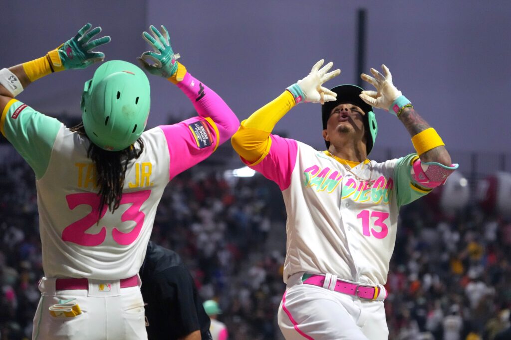
Colorful highlights inspired by the San Diego and Baja California communities are what gave these Padres Jerseys life. The bight red and blueish green complete this neon-themed dream. Similar to the Angels, being uniquely California can sometimes be difficult. However, like the Angels, they did incredibly well with the idea and execution.
San Diego is known to be a beautiful place to visit, especially during the summer months. The golden sunsets and beaches bring the surf, skating, and nightlife together. With the two-tone San Diego across the chest, the blue-green hat easily makes this jersey the best City Connect so far in the years MLB has been doing this.
Main Image: Kirby Lee-USA TODAY Sports


