A pre-season ritual I have started to find much anticipation in, is waiting to see the new spring training logos each team dons for two months while in camp. Each February, all 30 teams show up across Florida and Arizona to embark on a new season. Spring training is a time for hope and new beginnings. Seeing new faces your team acquired during the off-season or getting to watch some of the young prospects inside an organization for maybe the first time are both reasons to look forward to spring.
If you are like me, seeing out-of-the-ordinary jersey colors or the nontraditional spring training logos on the teams’ hat can bring a sense of excitement too. Some team’s stick with the normal logos on their hats with a different color scheme. Others bring out new logo designs to represent the city or team name in ways not used in the regular season. I looked over all 30 teams spring training logos and came up with the top five that were visually appealing.
The Top 5 Spring Training Logos of 2023
5. Atlanta Braves
Caption this. pic.twitter.com/vWkMrJruIu
— Atlanta Braves (@Braves) February 21, 2023
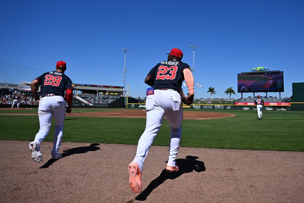
Although the logo itself is very similar to the traditional image the Atlanta Braves use in the regular season, the choice of color scheme brings a new flare to the design. The dark navy blue on top of dark navy blue outlined by red makes the logo pop out more than the solid white logo used in season.
The crossing of the A using a tomahawk adds a nice touch as a symbol of the team’s nickname Braves. It may be generic to some, but the out-of-normal color scheme landed Atlanta on my list.
4. St. Louis Cardinals
That Spring feeling 😎 pic.twitter.com/Fm4pCN0tnC
— St. Louis Cardinals (@Cardinals) February 23, 2023
The St. Louis Cardinals’ spring training logo took on a whole different look compared to their regular season design. Using an actual image of a cardinal, and even one that is different than the traditional cardinal on their uniforms earns them a spot on this list.
St. Louis could have been higher than fourth on the list. The red bird with red outlines on top of an all-red cap knocked them down a few spots. However, the outside-the-box design was enough to get my attention for the best spring training logos.
3. Texas Rangers
Spring Training games start today! 😄 pic.twitter.com/ErMgQ2ZiPt
— Texas Rangers (@Rangers) February 24, 2023
Maybe it’s the awesome color combination, or the full outline of the state of Texas, either way, the Texas Rangers found their way to the best spring training logos list. I’m not going to lie, the traditional large white T on the Rangers regular season caps may need an update in the coming future. In the last few years, the team has rolled out new jersey colors along with a new font across the front.
This year’s spring training hat has a design that could stick. The blue hat with the red outlined design of the state of Texas along with the abbreviation of the state is a top look. I’m not even a Rangers fan but I would buy this one!
2. Colorado Rockies
What's your sign? pic.twitter.com/Pl32vv8HOx
— Colorado Rockies (@Rockies) February 21, 2023
The Colorado Rockies had me going back and forth on weather to rank them the best of 2023 spring training logos or not. Not much recently has been going right for the franchise. They do however routinely roll out some nice-looking hat logos every spring.
The regular season hat is pretty boring to put it nicely. This pre-season design isn’t too much, but just enough flash to make the team look good. The purple outline of the rocky mountains is enough to make you want to rock the hat yourself.
1. Seattle Mariners
🔥 L A P I E D R A 🔥 pic.twitter.com/YrGIcP0fs3
— Seattle Mariners (@Mariners) February 22, 2023
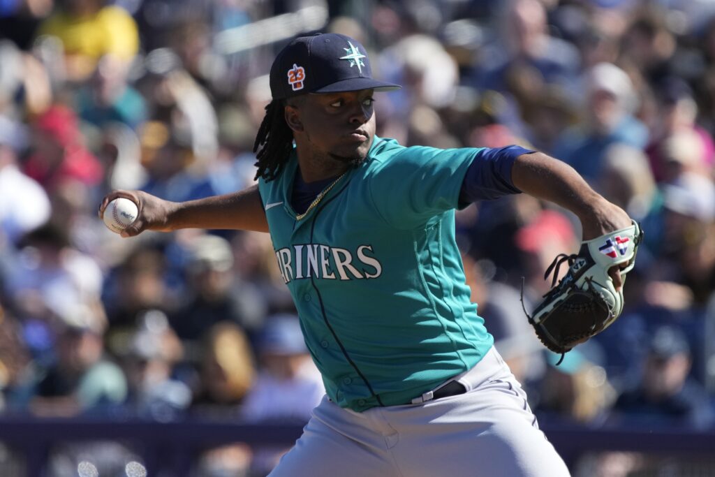
This Seattle Mariners logo takes the crown in 2023. It isn’t the 1980s style with the upside-down trident, but it is a logo that has meaning, along with an awesome color choice. The Seattle logo has always been backed with a “sea” theme to it. This year’s teal-colored compass overlaps a baseball printed on a navy blue hat that just looks right. It also doesn’t hurt that The Mariners team is an easy one to like.
Conclusion
Team uniforms and logos can sometimes make a team look better than they are. The old saying “look good feel good” applies when ranking the best spring training logos too. This list may not be on the same level as our own Drew Crabtree’s ranking of best minor league team names, but I’m sure every team on his list has an awesome logo to match the unique name.
Main Image: Rick Scuteri-USA TODAY


